WelcomeOntario website revamp
WelcomeOntario was a site dedicated to Private Sponsors and Settlement Workers assisting Syrian refugees who landed in Ontario.
This post examines how the web redesign dealt with overlapping content and vague audiences. These two issues created confusion among Private Sponsors and Settlement workers. As a result, the site did not help to understand each others' roles and personal journeys.
1) Challenge
Overview of the problem
- Users had trouble discerning what the content of the website was about
- There was a lack of classified content and a high volume of thin content
- Among users, there was a growing distrust of Private Sponsors in Service Providers. The latter caused disputes among Private Sponsors. Also, Syrian refugees experienced a culture shock
Main insights learned
- Interviews and user interactions helped me learn the complexity of each audience's journeys
- Mapping key friction points helped me with design choices
Learning from solutions
- Iterating twice allowed us to create a better tool for the three different audiences
2) Process and design intentionality
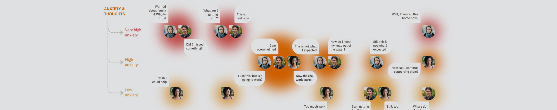
– Journey map section
Pre-initial research
- We met with an advisory committee. They gave us insights into what would help users find information based on who they are.
- We had consultations with different users and stakeholders. We identified the importance of being mindful of the usage of sector-specific wording.
External inputs that helped
- Pre-development: documentation, interviews, focus groups, SWOT analysis, competitive analysis, content, and keyword research
- During development (evaluation and validation): card sorting, user experience mapping, pain points mapping, user flow mapping, remote user testing, and interaction research
Insights from qualitative research
- Self-identification of users
- Content should be topic/information centered on post-arrival settlement services
- Undercovered many different interpersonal frictions among the three audiences
- It was essential to have settlement plan tools for people to work with
"I did not know there were settlement agencies to help me!"
"I know life is dangerous over there. But I can't understand why [the refugee] is missing home."
"I would like to know the roles and expectations of refugees and their sponsors when I work with them."
Insights obtained from the competitive analysis
- Competitors updated content very often
- The content was well organized and easy to read and process. It resonated with the targeted audience.
- Their sites lack aesthetics
- Lack of engagement on social networks
- They did not engage on social networks
Key takeaways that guided the identified problem space
- Analyzing each user's journey was essential
- Pain points, content, and personas overlapped each other often
- Setting healthy boundaries and expectations between each audience
- Website navigation needed a significant improvement
About the personas created
- There were two primary audiences: Sponsored Refugees and Private Sponsors
- There was a third influential audience: Service Providers
- Private Sponsors and Service Providers shared the same goal
- Sponsored Refugees and Private Sponsors dealt with mental health issues and stress
Exercises conducted during the ideation phase
- Card sorting
- User journey mapping
- Pain points mapping
- User experience mapping
- User survey
- Storyboards
- Wireframing
- Low fidelity prototype
- User testing
- Mockups
- High fidelity prototype
Outcomes of the ideation phase
- A user testing analysis resulted in a humanized design process. It helped to solve mental efforts experienced by the users.
- The prototype intended to provide an in-depth and customized navigation for each user. Yet, two of the audiences got lost searching for specific topics.
- The final iteration simplified the navigation and used the same interface for all the audiences. It re-grouped the content based on a timeline instead of topics.
- I chose a color palette that helped with the emotional issues faced by the users.
3) Design

– UI elements (section)
Key features of the UX
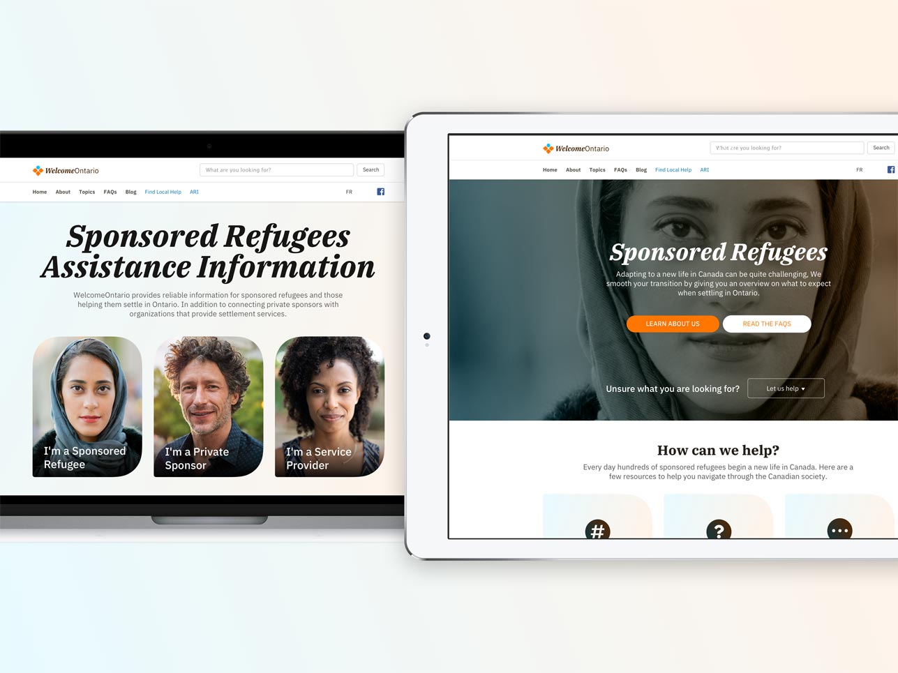
- Filtered self-identification of personas using portrait photographs
- Chosen photographs that expressed a positive motto
- Used a color scheme to support stability (main mood) and care (accent)
Progression of the designs from early iterations
- The main navigation and content of landing pages went from complexity to simplicity. We unified menus on every webpage and removed customized sidebars./li>
- Headers evolved from a dark version to a light skin
Design grounds from the initial research results
- Designs maintained user self-identification as a key element to avoid confusion
The extra rationale for design choices
- Usage of contrasted titles on photographs to categorize content based on competitors' analysis
- We collaborated with another organizational department (Promoting Mental Health). We did it to choose colors based on emotional intelligence for a stable environment.
Decisions made with branding and cohesive design language
- The new project color palette kept in mind other external brand colors. We used these colors in other sections of the website (211 Ontario and Allies in Refugee Integration program.)
Areas of improvement
- Design with components of Drupal first to cut reworking with CSS and Sketch
Next steps
- Moving from Bootstrap 3 to 4 will help with CSS and color palettes
4) Additional notes
What has worked
- A full kick-off meeting with all the parties involved in the website redesign. It provided a vision for the project.
- User experience methodologies helped with adding meaning to different design elements.
- Individuals involved in the project learned new ideas for website design processes—for example, card sorting and journey mapping.
- Documenting and sharing the design process.
What went wrong
- Lack of goals and direction from management. For example, they tried to implement a waterfall decision-making approach during the design process.
- Employee and management turnover stalled the project. As a result, it was in doubt several times, adding uncertainty to deliverables.
- There were barriers from some co-workers (unexpected survey modifications and delays). They stopped testing user concerns and validating assumptions.