Volunteer Connect Mobile App
This post is about a speculative exercise. Here, non-profit organizations experience different challenges when connecting with potential volunteer champions. The project's audience is in Ontario.
The case is part of a UX Design course at BrainStation. This technology school teaches courses covering the whole digital product lifecycle.
1) Introduction
Problem Statement
Non-profit organizations have trouble convincing volunteers to stay longer. They also have trouble mentoring others over time. For non-profits, engagement is ineffective when it does not happen face-to-face. There, the first interaction for this to happen is quite critical.
Before that, discovering matching volunteers was usually a long and frustrating process.
Project Description
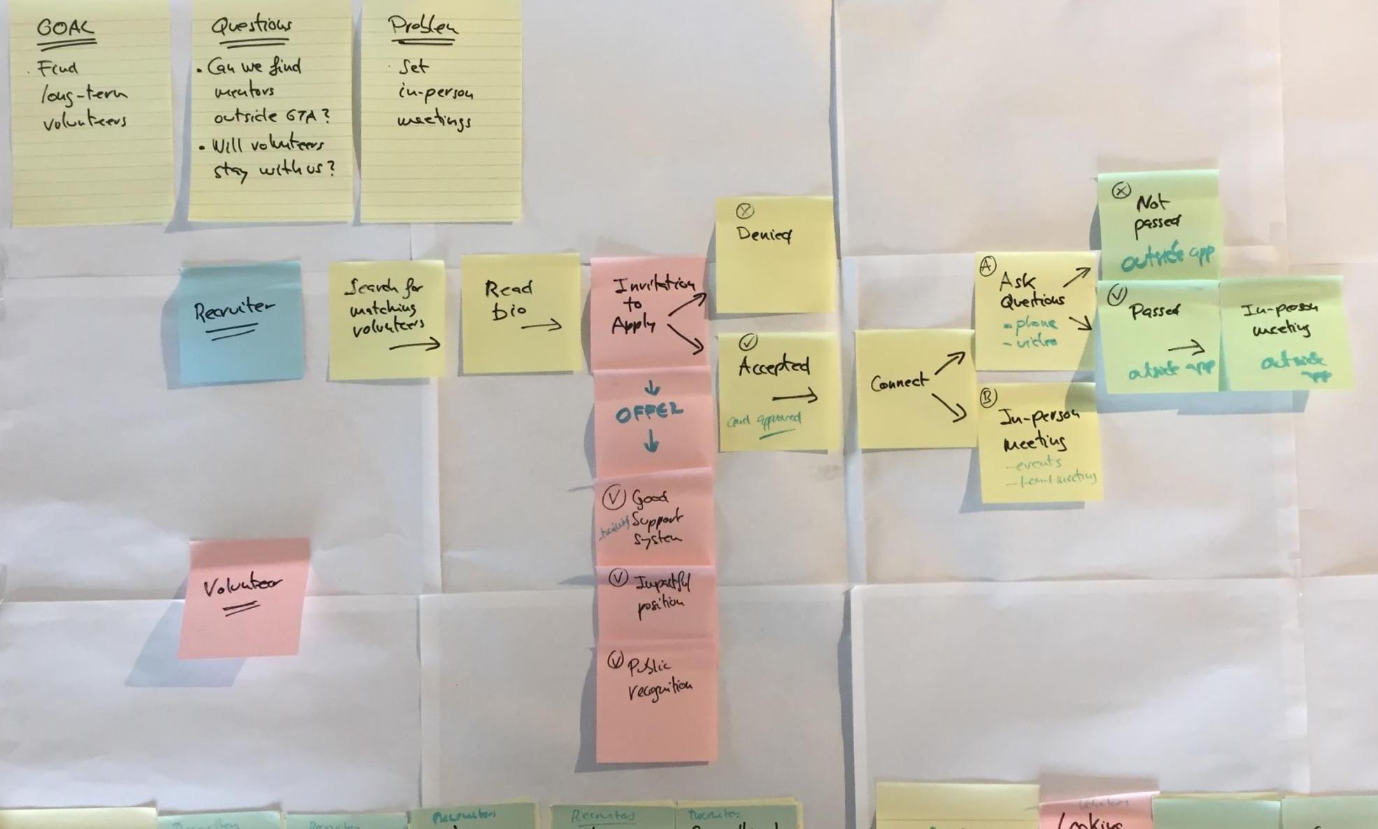
I presented a solution that focused on finding matching volunteers for volunteer recruiters. Here, it is vital to have a high probability of success during the first interaction.
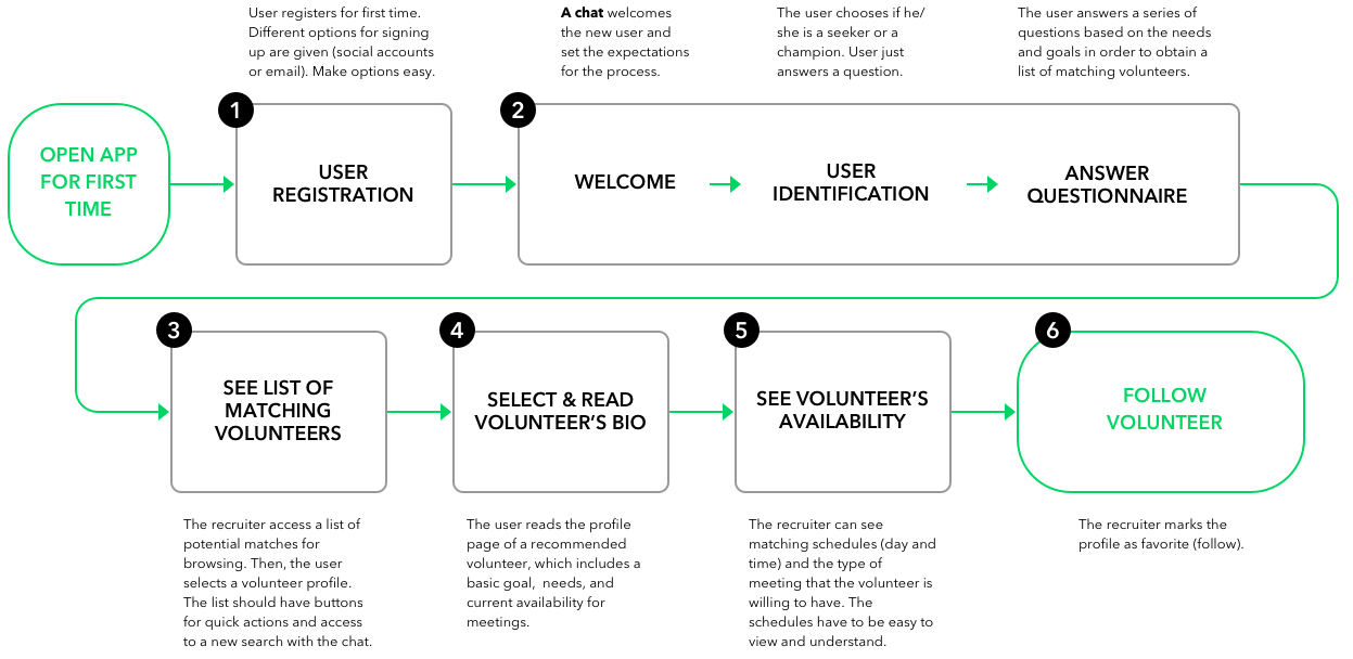
To do that, I used the app's main user flow:
- First, the recruiters set several needs
- Then, the app redirects them to a matching list of volunteers
- Finally, the recruiter and the volunteer schedule a meeting they are willing to have
2) User Discovery
User Interviews
I interviewed five different people at their offices and one at one event:
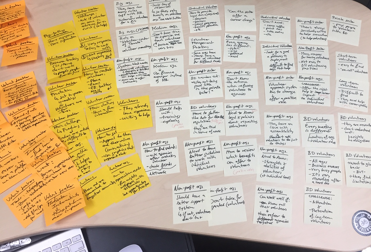
- I took notes of all the 1-on-1 interviews that I conducted
- Interviews were casual and lasted for about 20 minutes on average
- I wrote down my notes on post-it papers
I found that the interviewed people worked with volunteers at two levels:
- Programs and boards of directors, including volunteer recruiters
- Project coordinators
I also interviewed long-term volunteers outside of the organization.
I divided the interviews into two sets of questions:
- The first phase was about personal user experiences
- In the second phase, I asked about the organizations
Insights from interviews
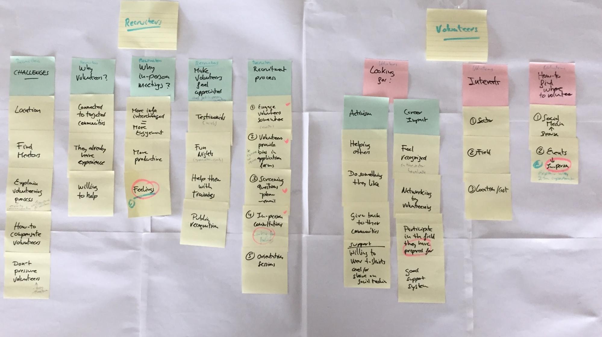
Two things were vital for all the following steps of the project's development:
- First, finding patterns and common questions
- Understanding the user and their problems as much as possible
Users provided more specific details of their work process at questions in phase 2. But, again, these were questions about the organizations they were working with.
I found that non-profit organizations needed to improve their volunteer support systems. They should focus on volunteers seeking an impactful career path. So then volunteer seekers could better engage with the organization.
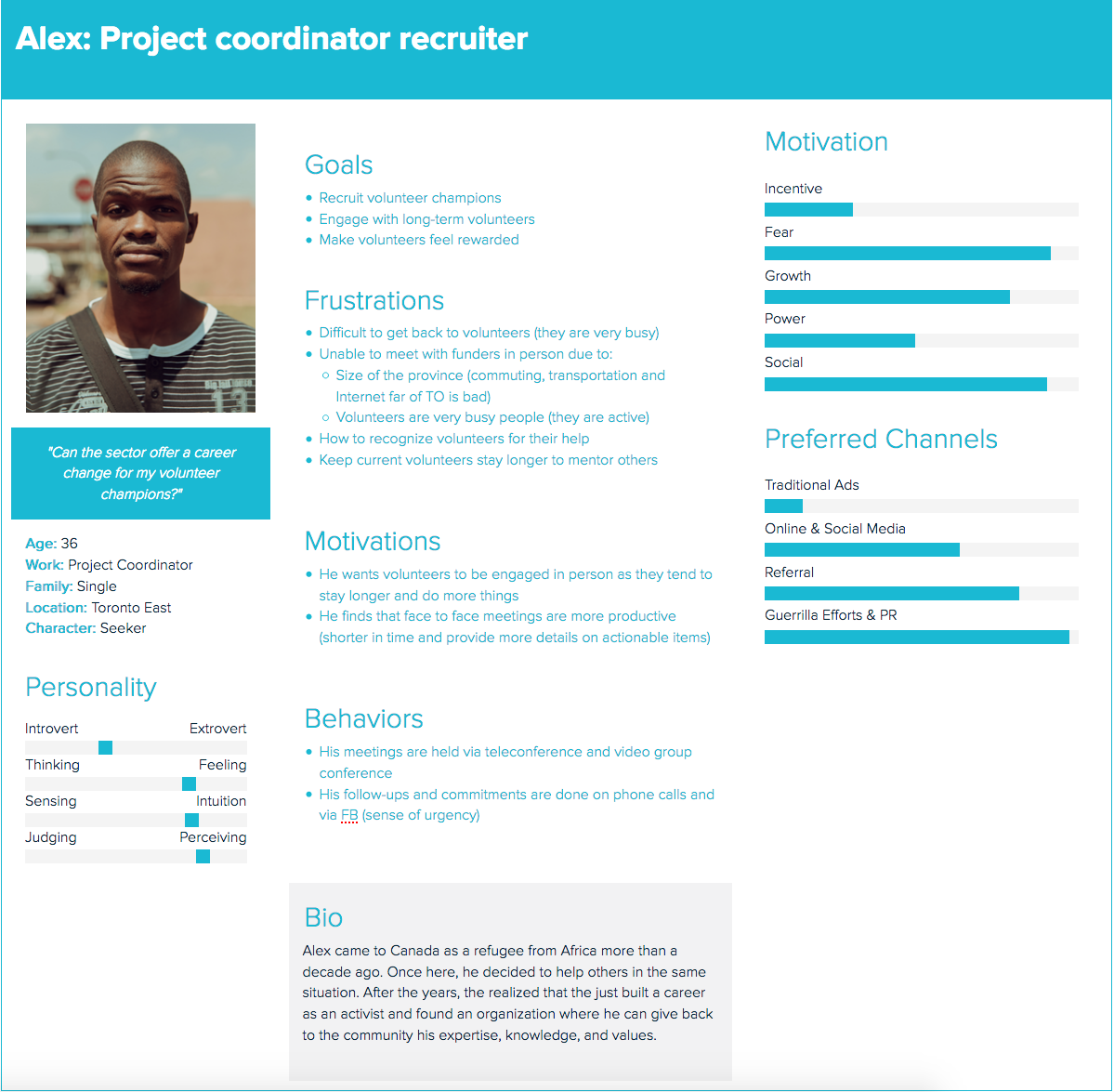
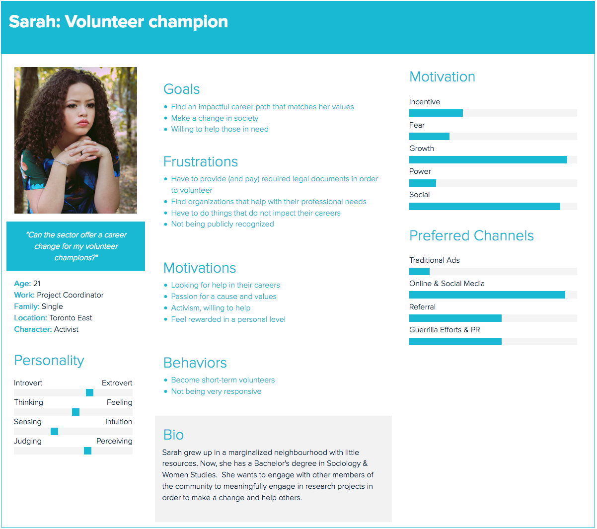
User Personas
3) Information Architecture
Sitemap
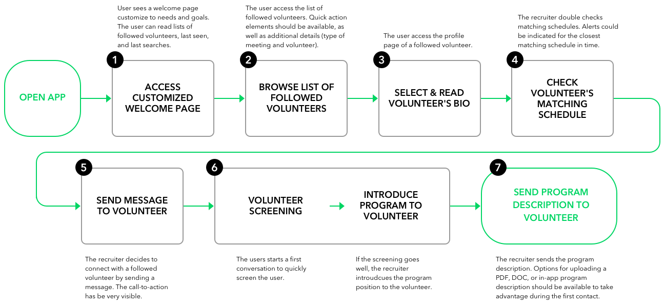
User Flows
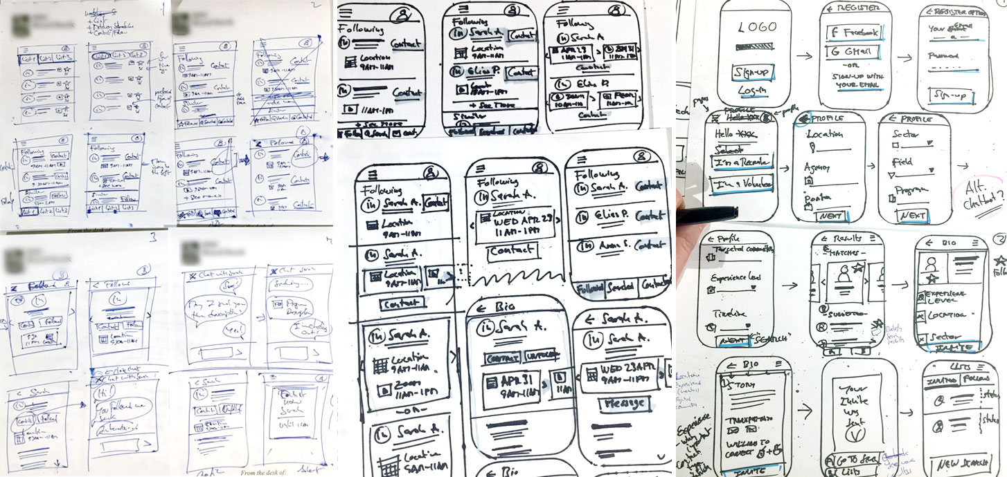
Sketching
POP Testing:
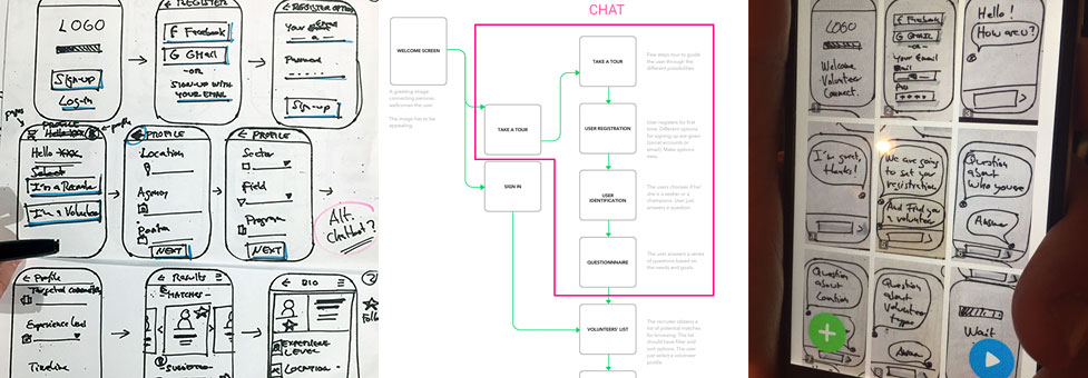
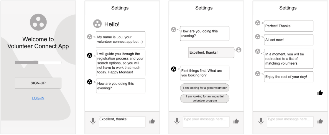
In the first sketches, a user went through different sections of a long form. So, I moved the welcoming settings, user identification, and questionnaire within a chat. This part solved a tedious process. I learned that simplifying similar tasks of a process can make experiences easier.
4) Wireframing
Wireframes, task 1 (setting process)
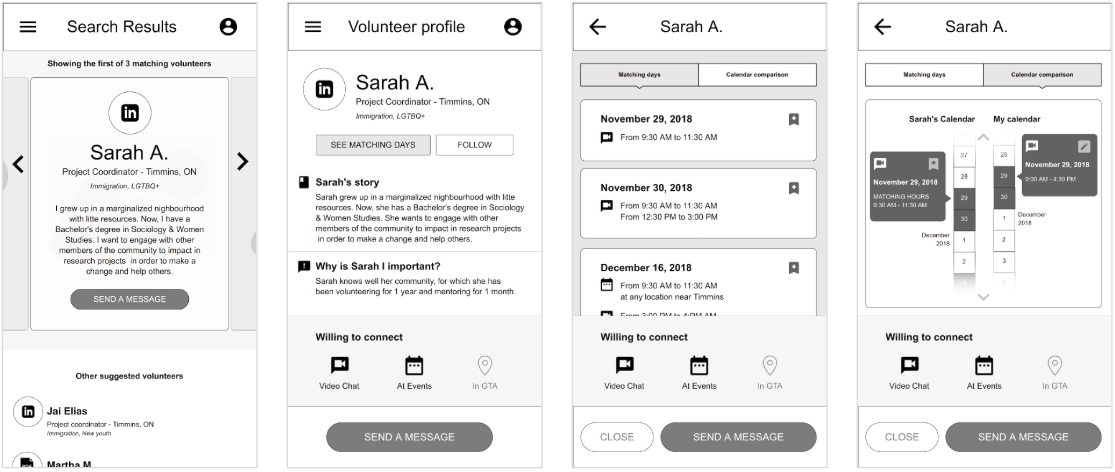
Wireframes, task 1 (volunteer research)
5) Prototyping
Clickable Prototype: Prototype created with Invision App.
Usability Test
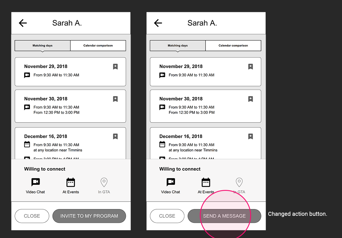
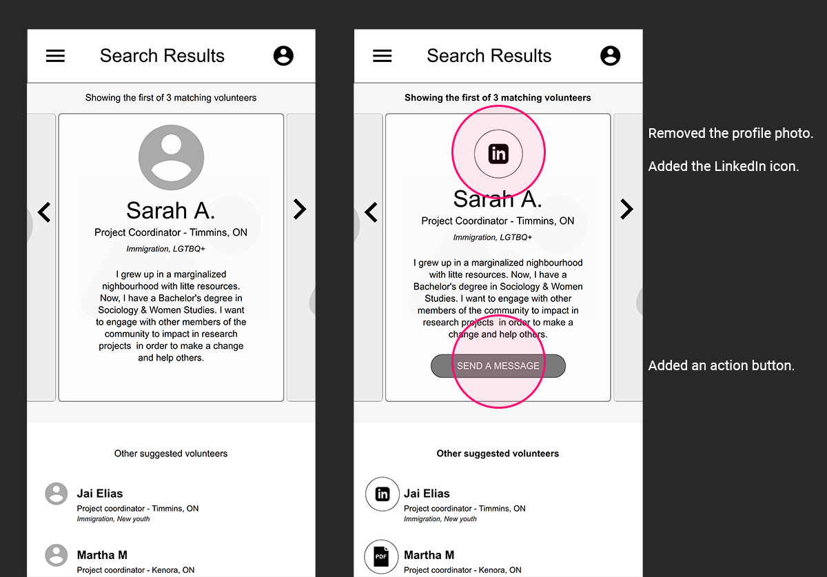
After testing the prototype, I applied some changes obtained from users' feedback. The main change affected the primary contact between recruiters and potential volunteers.
Recruiters proposed to contact volunteers from their bios, given the new opportunity. Before, it was common practice to invite volunteers to programs before meeting them.
6) User Interface Design
Style Guidelines
7) Learning Outcomes
The solutions come more straightforward when the problems are very well understood. Asking the right questions is vital to get to the point faster at any project stage. For example, the card sorting process was short and weak. As a result, I had doubts during the rest of the project until the usability test.
Also, targeting a single main problem helps one better understand the big picture.
Finally, I found that this type of app could have a successful application in real life.
