SEO/UX: An IA Strategy
Case study on how a new IA helped 1.7M people find relevant information on the settlement to Ontario.
1) The Situation and the Goal
The Ontario Council of Agencies Serving Immigrants wanted to rebuild its flagship project, Settlement.org. It is an informative website for immigrants.
The main goal was to surpass the government funding traffic requirements. Also, attract new traffic from newcomers to the province.
2) The Challenge and the Design Question
Newcomers to Ontario were looking for accurate, consistent, and high-quality content. They also needed answers to their questions on how to settle in Canada, which Settlement.org did have. Yet, people did not find the type of information they sought on Google.
So, how might we help more newcomers find qualified information to settle in Ontario?
3) The Approach
The team's idea was to produce "look-and-feel" mockups of the web pages. Then, get continuous feedback from the office and approval from management and founders. Finally, move forward from there, which was the usual practice within the organization.
I considered a different approach. So I conducted an SEO audit and analyzed user research. I used a province-wide study on immigrants and refugees done by the organization. Along with that, I looked at the website user satisfaction survey.
While working on it, I shared my research insights with the team members. First, I explained the benefits of taking SEO and Information Architecture (IA) best practices. Then, we started to review the navigation and the organization of the content of the website.
This practice helped the team to rethink the design process. Also, how to align it with the project goals from the start.
The main insights of the user research
23% of the immigrants to Ontario reported using the Internet as the primary source to find help.
Immigrants needed qualified information, which should:
- Come from a trusted source
- Be accurate and consistent
- Must meet qualification criteria for what they consider high-quality content information
Visitors read the articles. They spent an average time of almost 2m20s on a page.
There was a mismatch between what users needed and the most read content on the website. It was very clear from the user surveys and website analytics.
72% of the total traffic was organic. During the previous three months, Half of it was from Ontario. This type of traffic was a primary target for the organization.
88% of returning website visitors left the site right away. It happened among the users using the main menu of targeted topics.
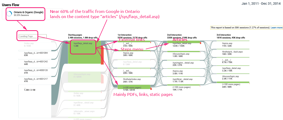
As per GA, the article's content type represented most of the traffic.
Med-tail keyword phrases were predominant. Primary and secondary 2-3 keyword phrases were 87% of organic traffic from the province. Detailed searches of 4+ keyword phrases made a 7%.
– Behaviour flow for the targeted audience (GA).
– Trends: Keyword phrases segmented by several words (GA).
The Information Architecture evaluation
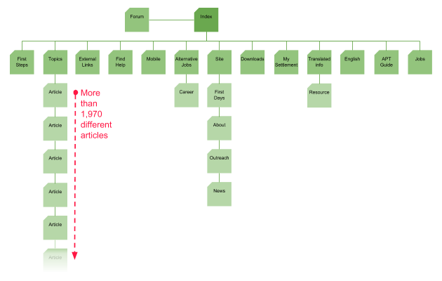
The content organization was inconsistent. There was no internal linking structure that organized content by topics. So it did not send value among different levels of webpages for both people and search bots.
Website information was weak. For example, webpages were not using canonical URLs. It resulted in many duplicated content and non-keyword relevance in the URLs. So, the site prevented search engine bots from indexing the content. Also, articles did not follow semantic HTML best practices.
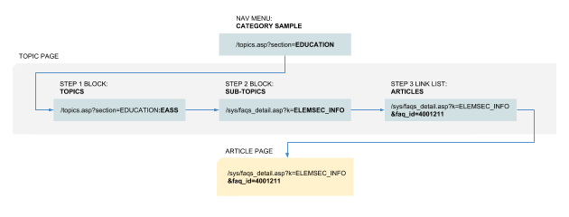
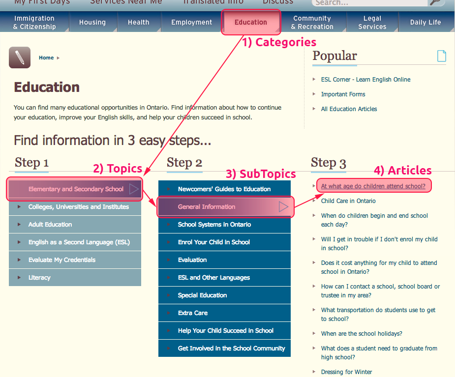
The site navigation for the articles was poor. The core navigation for the articles used a system of different steps. Organized in blocks, they drove people to a limited number of pieces. Visitors clicking on any item in the main menu ended up using the same browsing system.
The solution explained
I used user behaviors and interests to define a website structure and strategy. So, we used SEO to create a valid IA. The outcome was to help users find information and increase organic traffic.
We focused on the IA of the articles as it was the website's core for the visitors.
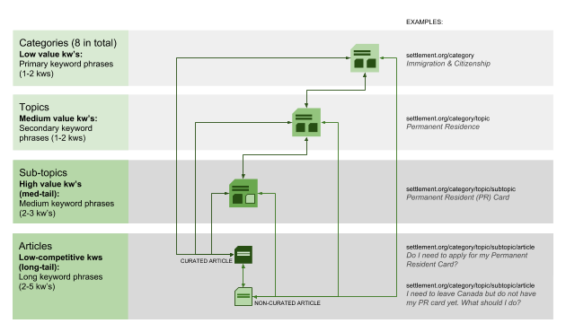
We planned an SEO pyramid based on a medium and long-tail internal linking strategy. The idea was to make our content easy to find by search engines as well as for people. We used topic-wide linking for connecting topics.
Meanwhile, we worked on content semantics. We used curated content and internal links for each page depth to send link juice. We also made web pages SEO-friendly. So we optimized page elements like metadata, URLs, page titles, and HTML semantics.
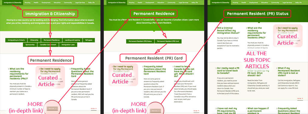
– Navigation based on content semantics. Curated articles linked to in-depth keyword phrase webpages.
4) The Results
We planned six months to start seeing favorable results from the organic traffic. But, it happened in a few weeks. As a result of the new IA, 1-2 keyword phrases (low value) dropped. 2-3 keyword phrases (high value) went up by 60% in 8 months.
After eight months, settlement.org overpassed the founder traffic requirements by three times. Also, the top articles started to reflect the people's interests indicated in surveys. The organic and general traffic became steady during weekdays. In the end, organic traffic was 90% of the total traffic, helping people find our content on the Internet.
5) The Success (or Failure) Measurement
Since the goal was quantitative, we used Google Analytics to measure the results of our labor. For example, overcoming founders' goals was the way to measure failure or success. Besides, we conducted a user satisfaction survey to learn more about our new users.
We had continuous informal follow-up meetings to let management know what worked:
- A favorable switch experienced by the website
- Its impact on newcomers
Also, the team received much positive feedback from different agents in the sector.
Aside from the quantitative funding requirements (traffic), various qualitative elements improved. For example:
- We provided equal opportunities for all article topics
- We reached visitors interested in post-arrival services by orienting content in this direction
6) The Effects of the Process
The lessons learned
Documenting every step was helpful for future projects. This practice wasn't done before as part of a design workflow within the office.
Handling things with sensitivity in an office with no design culture was vital. We found a solution by avoiding rejecting a new approach.
The compromises made
The extra effort put into educating on different design processes. A mindset change in an office used to other workflows doesn't happen fast.
Adapting requires time. Over time people learned many different aspects of web design. They were willing to collaborate to create a good website. Hence, the result was much better than the previous versions, and we achieved the main goals.
